Navigation
The navigation section has a lot to offer.
Bootstrap has a whole bunch of pre-written classes to be used with menu's / navigation bars!
This slide will show you a few of the more popular navigation classes.
Also you can search 'bootstrap navigation classes' and get a whole bunch of good resources.
You'll create a navigation bar of your choice for this website, below are some cool examples to look over!
All of the examples below use bootstrap navigation classes!
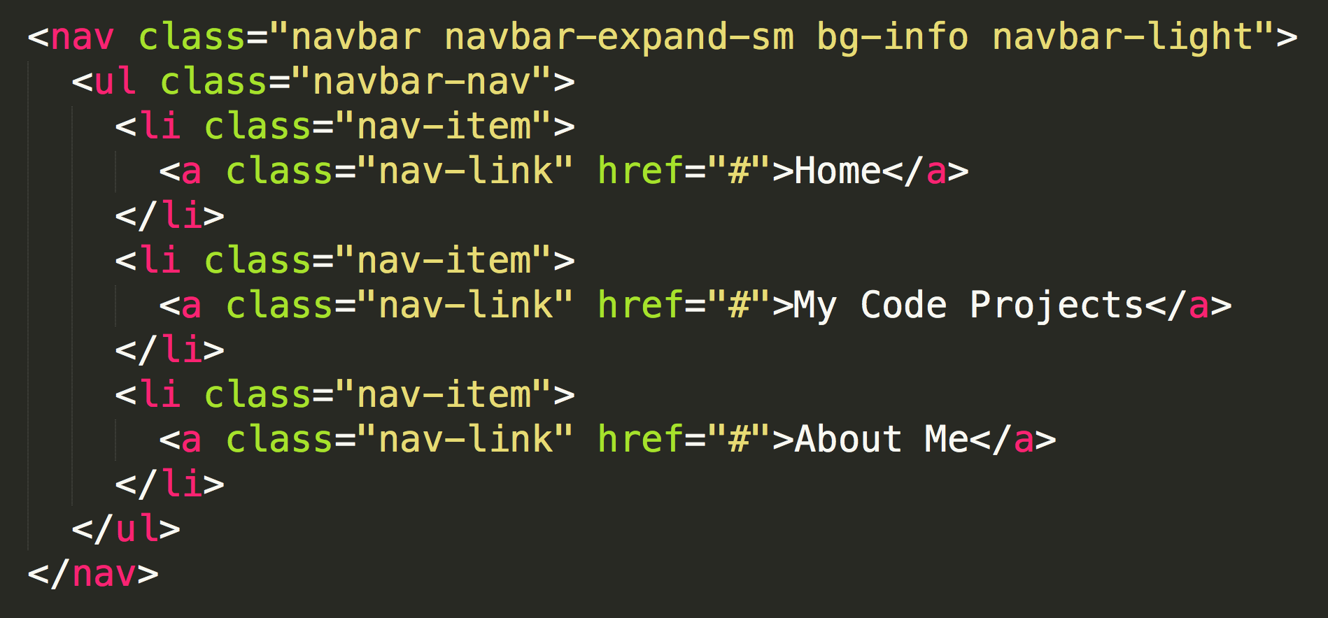
Standard Bootstrap Navigation Bar (click on 'About Me' to see the code):
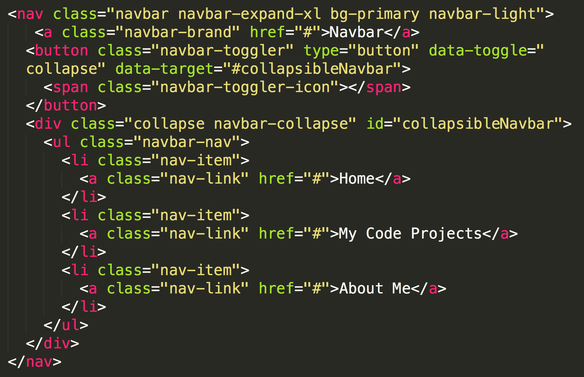
Collapsed Navigation Bar: (Click the 'hamburger' button on the far right, also click on 'About Me' to see the code).
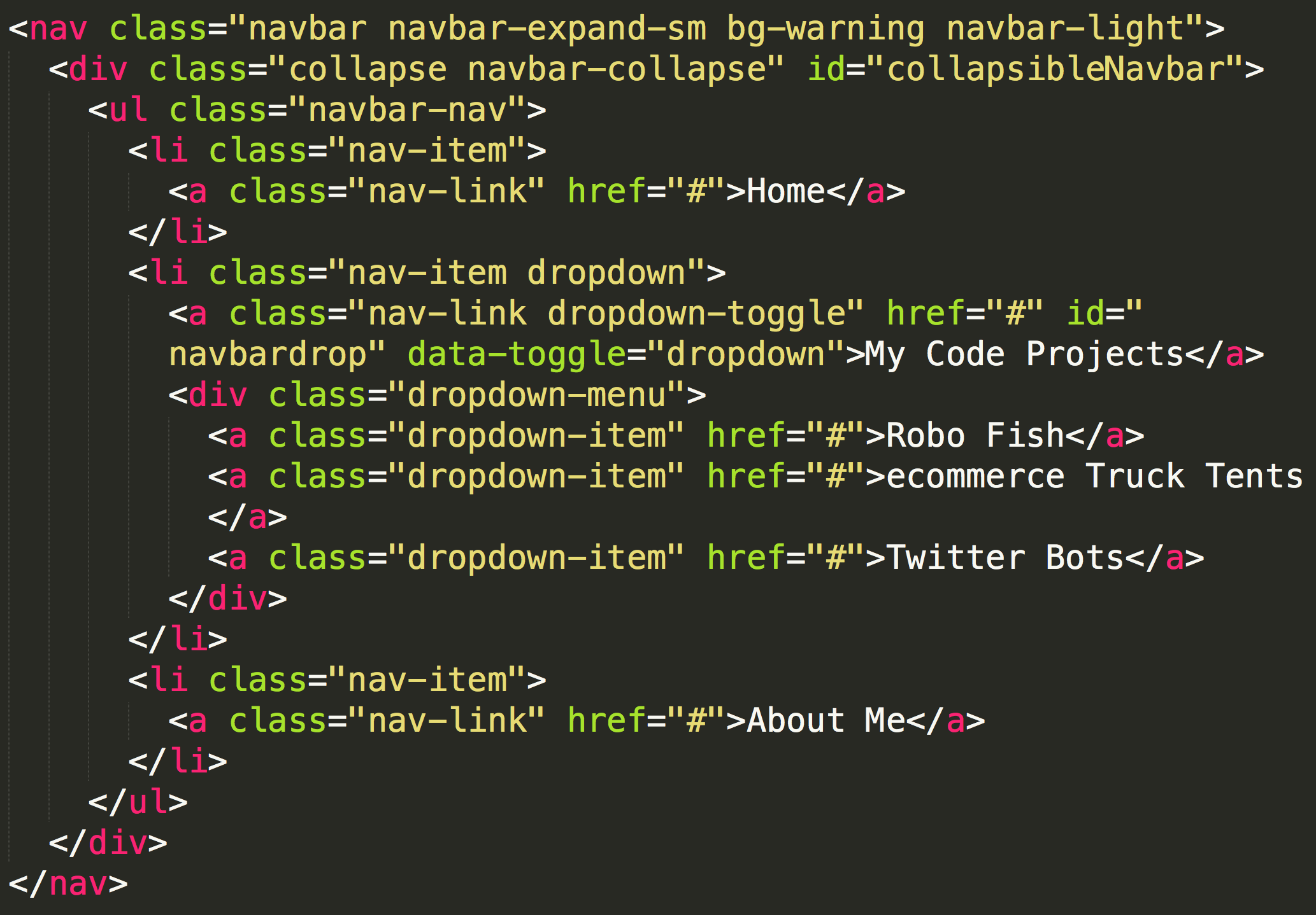
Navigation Bar with Dropdown: (Click on the arrow next to 'My Code Projects', also click on 'About Me' to see the code).
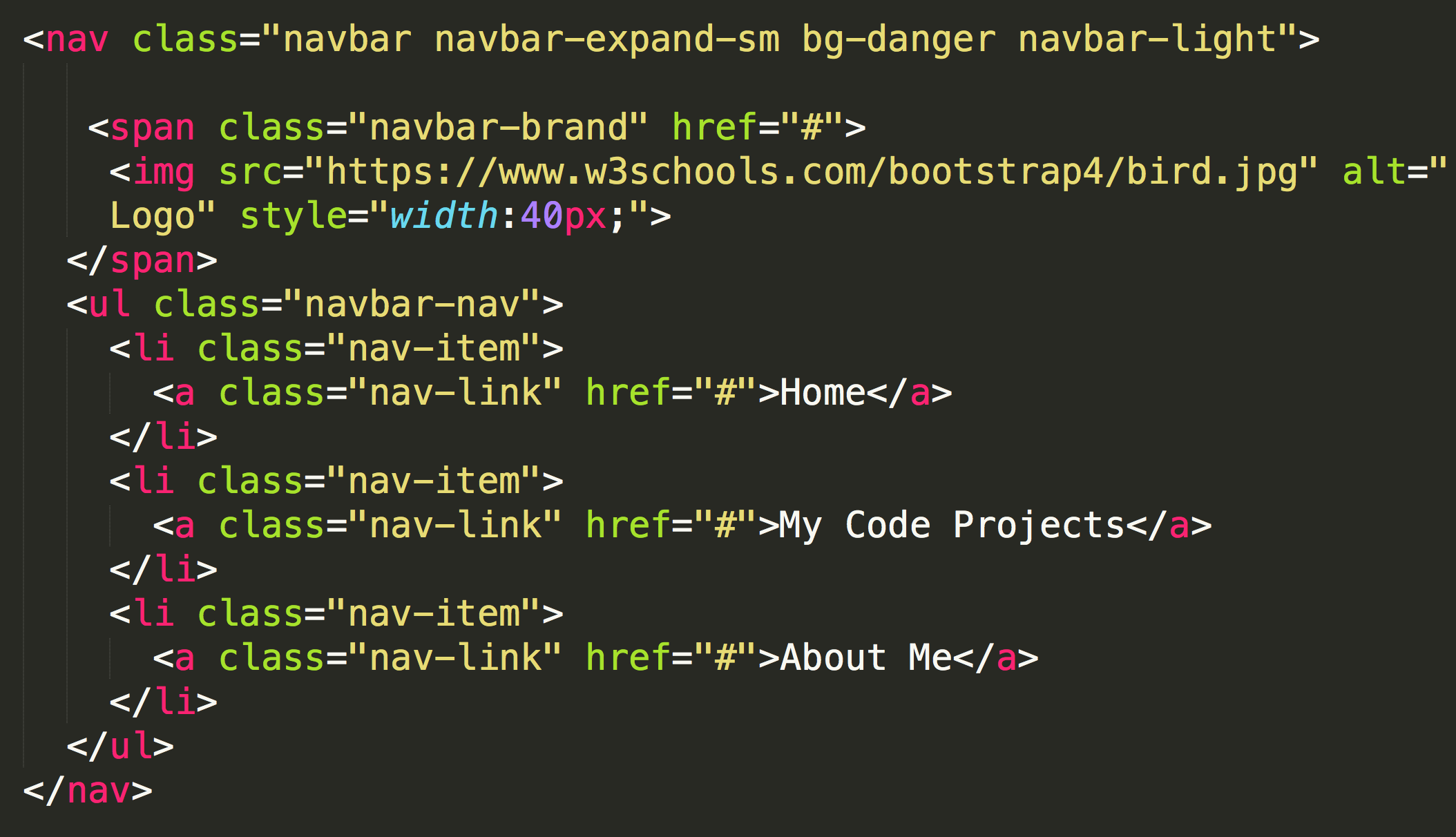
Navigation Bar with Image (click on 'About Me' to see the code):
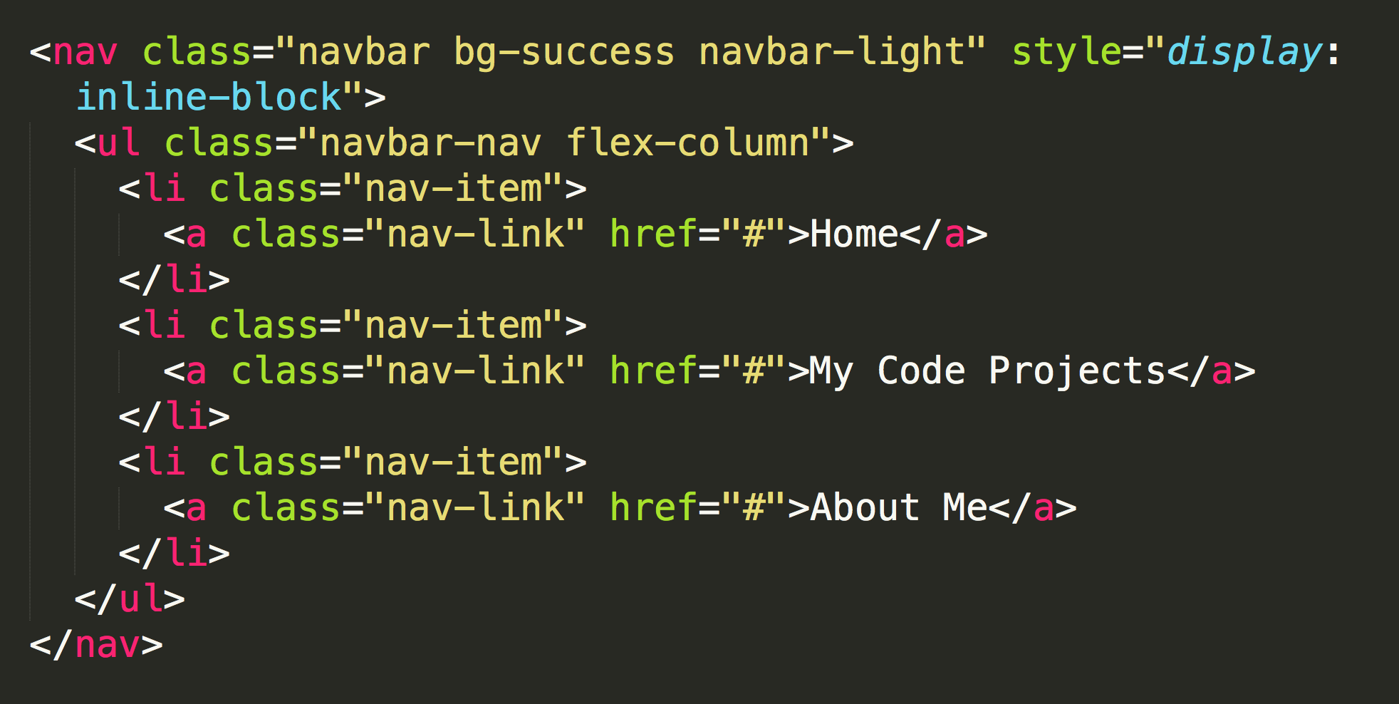
Vertical Navigation Bar (click on 'About Me' to see the code):
Those are a few of the most common classes you can implement into your navigation bar. There are, of course, others.
Feel free to view more at w3schools & on Bootstraps main website.
The next slide will show you the classes that create these nav bars with the practice involved too!
Nav Classes
In previous slide showed you some common navigation bars.
This slide will go over the classes on how they were created!
Let's start with colors!
<nav class="navbar navbar-expand-sm bg-info navbar-light">
<a class="nav-link text-primary" href="#">Home</a>
Dropdown Action!
Follow the directions on the left!
		<li class="nav-item dropdown">

      <a class="nav-link dropdown-toggle" href="#" id="navbardrop" data-toggle="dropdown">My Code Projects</a>

      <div class="dropdown-menu">


        <a class="dropdown-item" href="#">Robo Fish</a>


        <a class="dropdown-item" href="#">ecommerce Truck Tents</a>


        <a class="dropdown-item" href="#">Twitter Bots</a>


    	</div>


    </li>
Activity!
This Activity will walk you through:
			<div class="row">


					<div class="col-sm-12" id="menu">


						<nav class="navbar navbar-expand bg-info navbar-light">


						</nav>


					</div>


				</div> <!-- end menu row -->
Only copy in the code in bold.
The other tags are just to show you where in you index.html page they go.
			<div class="row">


					<div class="col-sm-12" id="menu">

						<nav class="navbar navbar-expand bg-info navbar-light">


							<ul class="navbar-nav">


							<ul


						</nav>


					</div>


				</div> <!-- end menu row -->
Only add the code in bold.
						<div class="row">


					<div class="col-sm-12" id="menu">

						<nav class="navbar navbar-expand bg-info navbar-light">


							<ul class="navbar-nav">


								<li class="nav-item">


    						</li>


    						<li class="nav-item">


    						</li>


    						<li class="nav-item">


    						</li>


							<ul


						</nav>


					</div>


				</div> <!-- end menu row -->
Only add the code in bold.
						<div class="row">


					<div class="col-sm-12" id="menu">

						<nav class="navbar navbar-expand bg-info navbar-light">


							<ul class="navbar-nav">


								<li class="nav-item">


										<a class="nav-link" href="#">Home</a>


    						</li>


    						<li class="nav-item">


										<a class="nav-link" href="#">My Code Projects</a>


    						</li>


    						<li class="nav-item">


										<a class="nav-link" href="#">About Me</a>


    						</li>


							<ul>


						</nav>


					</div>


				</div> <!-- end menu row -->
Only add the code in bold.
The next step will EDIT code you have in your stylesheet.css file.
				#menu {

				margin-top:10px;

				}
Your #menu reference in your stylesheet.css file should now ONLY have the margin attribute.
Great Job! If you're menu bar looks how you want, move on to the next lesson!